Showing posts with label Film work. Show all posts

Monday, 21 May 2012

Films Stills & Identity


Went through the film again and selected more stills which I find interesting, and which may look good printed out on a larger scale. I purposely chose not to edit any of the frames as I feel there is more value and appreciation for the film to observe frames in their original format. Through observing singular frames it gives me time to fully appreciate the work and exploit a fleeting moment. The rush of the frames when the film is played at its original speed makes us miss valuable transactions of frames. However I understand it is the bombarding speed of the film which makes the scratch film unique. 
I selected frames, each where there are different strengths of line markings and tonality variations. Each mark is unique to me and my mood at the time it was created. As I look back over the results of the scratch film, I have more respect for the process and mark-making. Mark-making is as unique as a fingerprint and each range of marks have their own individual narrative. Although the fingerprints are obvious in evoking the subject of identity, I find the singular scratch marks more effective in reflecting identity. Marking on the film was hard to control therefore at times was unexpected, especially when applying vigorous marks; in this respect the markings signify our own unknown nature as humans. 
Interpreting the work in this way I feel relates back to my portraiture work and how I wanted to show identity in a fragmented way, reflective of our disjointed lives and how we project fragments of our personalities (dependent on context). Although I am not continuing with my portraiture work, the interpretation of a self-portrait can still be observed although in a different format. 

Tuesday, 15 May 2012

Collage of Film Photos

#1
#2
#3
#4


 Film, Tacita Dean, 2011


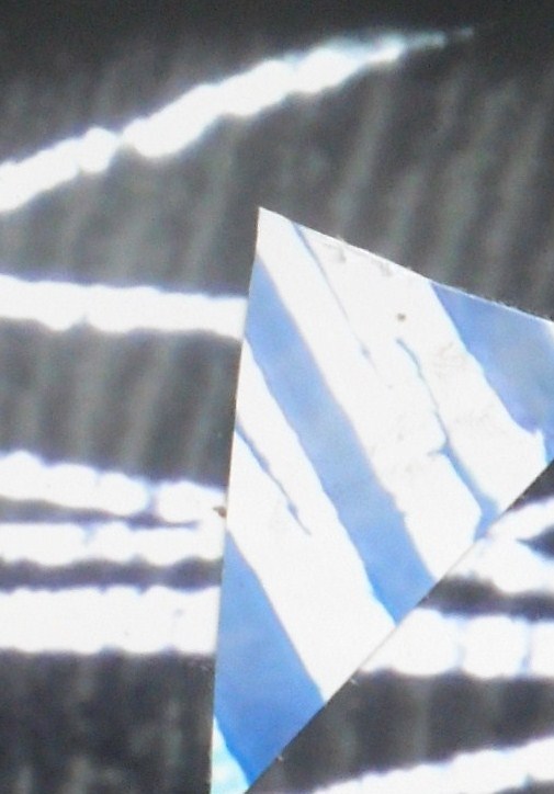
After my thoughts about Tacita Dean I looked through some photos I took and observed the shapes she cuts from the film frames, which inspired me to re-work my film stills. By cutting triangles and circles into the photo I wanted to make the image more active and force an interruption of line and tone. This also makes a variety of focal points. This experiment seemed to work well, although depending on the photo I work on. I wanted to explore both brighter and more subdued tones, therefore tried to mix the tones; although I originally liked the duller frames (#3), I wanted to make it more diverse, however from this experiment I can see it appears too obscure and unbalanced. As I was also looking for brighter colours I choose to use a photo from my primary research of a rock (#1), although I feel the still film images worked better as the framing encloses the space of the composition.
Despite the confusion the coloured shapes creates, I feel this works although in localised areas. For example '#3' appears too abnormal, however when cropped it makes a more appealing composition. The interruption of colour and line adds to the layering and complexity of the image and is easier to observe no as the eye is not distracted by the other shapes and colours.


Through each layer a new texture is revealed which is something I aim to encompass within my paintings. A textured surface when painting allows for a range of markings to be created as the brush and paint take different effect to the variations in depth of surface, this can be oberved in the work of Antoni Tapies. By layering textures this reflects the layering technique I used with the film.


Sunday, 6 May 2012

Film studies


I began working from the still images. This particular still reminded me of paint drips therefore when re-creating this I wanted to make a range of drips. The photograph is only a starting guideline towards the image I create. For this reason my interpretations do not look exactly like the photographs. I am looking to exaggerate and heighten aspects of the image, this is why I have made numerous lines of drips visible instead of only showing four such as in the photo. By working from the still images I have come to enjoy the use of a frame in the composition as it encloses you into the image. I ensured a heavily diluted application of paint to create a haze of layers and to make a diffusion of tone, establishing an aged surface appearance. I feel the lighter orange study worked best as the white of the lines do not stand out greatly, as they do against the blue, and I achieved the diffusion of tones I wanted.


Friday, 4 May 2012

Film Footage


Original Footage


When watching the film for the first time I felt rather bombarded and overwhelmed by the speed, however when looking back at the original before edits, I have learnt to appreciated the natural speed to which it is intended. From this speed I enjoy the spontaneity of each frame and how you begin to recognize new sections of the film each time. When scratching on the film I hadn't thought about sounds, only the image, but when watching the footage I feel the sound of the reel creates quite an atmosphere to watch the footage. It reminds me that this is a process not often used anymore when there is now the option of producing something digitally. I particularly enjoyed the manual process of producing a piece of work such as this. I also respect how the work doesn't require a raionalization as many paintings I have made in the past do, and this can be considered simply as an exploration of space and movement.  


Black & White edit

Orange Tint

This edit is perhaps the most effective for me. Where I replaced the black with orange it has made the view more panoramic rather than being enclosed in a space of darkness. I feel by using brighter tones, it has made the image more inviting and  through slowing the speed, I can observe the variations in strength of line, but also view the effectiveness of using a mix of technique on the film strip. The orange tint also gives an antique appearance to the image which relates to my painting work as I am looking at aged surface qualities.

Thursday, 3 May 2012

Film

I saw the film projected today and began work editing the sequence of frames, but also started to understand the techniques that worked to exploit in the future.Whilst working on the film strip I now realize how I soon forgot the scale to which it would be projected, therefore I was pleasantly surprised by the enlarged markings and fingerprints. The speed of the film was also a surprise to me, the rapid movement of line reminded me of the movement of a paintbrush. As I watched the film numerous times I began to notice different qualities, for instance the way there would be an active area which would then die down; this is something I am considering using in the next piece of film work.  
Whilst editing I adjusted the speed and although I wasn't expecting to like it, I found that by reducing the speed to 5% I enjoyed the slow movement as it allowed the opportunity to watch the evolution of a line. It also allowed a careful observation of  the smaller details such as the fingerprints. 
Whilst editing I also looked at varying tones to explore the compositional elements. I found taking still images very useful as I can document the various changes I explored, but they are also great to consider as pieces of photography and as a basis for a painting.   

This was before any edit and I selected this still image as it heavily reminded me of paint drips, also this simple composition could be effective when making a painting from this.  


By exploring various effects on the computer I burred this so the subtle colour  changes can be observed , although I feel a frame that was more active may have worked better. 


I specifically like this image because some areas are in focus whilst other areas remain unfocused which is very effective as we can observe a contrast. It also reminds me that the simplicity of black and white can sometimes be most effective, and that vibrant colours are not always needed as mark making can say more about an image.

By altering the colour I feel it opens up the viewpoint making it more panoramic, rather than the image being enclosed and blocked off  with blackness. In selecting tones that are fairly close I feel it is more striking than using complementary colours. The compositional balance makes this an intriguing image to be considered as a piece of photography.  

As the colour outside the frame is usually darker than the inside colour, I decided to invert colours  to make the  markings more identifiable. I feel this works well as the exterior doesn't feel overwhelming however I feel using similar tones with white lines is more visually pleasing as it appears brighter and more atmospheric.

These last two tinted edits I feel show particular resemblance to the work of Rothko and the hazy edges of the frames remind me of his rough marks of transition of colour.