Monday 28 May 2012

Tate Liverpool - Charline Von Heyl

Yesterday when visiting Tate Liverpool I attended the Charline Von Heyl Exhibition. As she works in an abstract manner I found the exhibition highly beneficial. Upon entering the exhibition, I was curious why there were no booklets with written information on the artist which are usually handed to you along with your ticket. When asking a gallery assistant, they mentioned the artist did not want any words firmly attached to her work, and preferred people to view it without any prior knowledge or explanation. I was also told that the works had be strategically placed in a particular order by the artist, which I kept in mind as I walked around the exhibition.

I found her work to be very striking due to her large assemblage of colour and form. Although she works without any pre-planned idea, her images maintain a structured rhythm. By working spontaneously, some could consider this to be our true state of mind; I particularly enjoyed thinking about this when observing her work as you can begin to consider how someones mind works.
I soon began to realise the canvas' sized were overall the same size, square. Observing this made me think more about the presentation of my own final works in the exhibition.

The way she works without arranging her composition's through sketches first, truly demonstrates the freedom of expression. Considering also the work of Frank Bowling, as he also works spontaneously, encourages me to work without contemplating how I want the finished image to appear. Through doing this I am still able to explore the formal elements of art, but also present a more natural expressional piece of work.


Saturday 26 May 2012

Formalism

Compilation of information about Formalism informing the development of my work over recent weeks:

I chose to research Formalism understanding that it is based around the way artwork is made rather than the value/concept of the work. This theory applies to my work as I am exploring the surfaces of an image and the texture created in the application of paint, in contrast to finding a higher level of significance within the works.

This approach to art began during the 19th and 20th centuries (however the idea of formalism dates back to the time of Aristotle and Plate), although initially instigated by the Romantics and their search for the significance of Art, Symbolists and Post-Impressionist highlighted the importance of form to inform the intent of the artist.

Formalism is the term used to characterise the divide between the significance of the artwork and its production. It is involves an examination into the formal elements of art, line, colour, texture and composition, all the qualities which form balance and rhythm in an artwork; therefore the accomplishment of compositional elements must be achieved prior to an accomplishment of representation.

I feel that viewing artwork concerning formalism can be refreshing and more simplistic. We often tend to follow human nature and attach meanings to what we see, or decipher the significance of an item of art. Exploring formalism has taught me to examine the finer qualities of an artwork.

Considering a formalist judgement allows an exploration into the visual and technical qualities of a medium that give it a particular appearance; without materials we cannot create art, it is the medium which we should primarily respond to and value in art.

My understanding of formalism informs the production of my artwork and develops my critical judgement of mine and the work of others.

Reference Material:

Newall. D & Pooke.G (2008), Art History the basics, Routledge.  
ISBN: 0-415-30908-5

Harris.J (2006),  Art History The Key Concepts, Routledge
ISBN: 0-415-31977-3


Friday 25 May 2012

Primary Colours Triptych


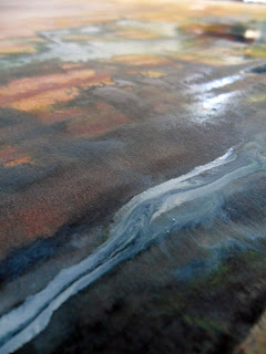
I am now viewing paint as the subject matter, with formalist views in mind, I have chosen to produce a triptych of the primary colours as this is the basis of colour. I wish to produce layers of paint to make the surface thicker. This makes the audience understand paint as a physical substance instead of treating it as a material available for manipulation. I wanted to document the change as I will change the layers over a series of days. I also took close-up photographs to observe the interaction of colours, and the interaction of paint on canvas. All the photos I collect I wish to make part of my finished piece as they not only closely examine the qualities of paint and mark making, but as they visually define the term abstract; due to the emphasis on the formal elements, colour and line.
When taking the photographs, the red and yellow canvas produced more appealing images, but I was finding it difficult to produce as strong an image from the blue canvas. After examining the canvas' together I observed that the blue canvas had less textural marks, but more areas where turpentine has washed down the inks. Photographing theses surface interactions made less interesting photographs, therefore through the next layers I want to make thicker interactions of colour.


I also worked on the combination of film stills again (although I started it before I decided to stop producing work from the stills, it needed finishing). The painting went through numerous layers and areas of definition. I realised that it was not working well due to the various layers of vivid tonalities fighting against one another. I kept my sketchbook open next to me as I work, therefore I could observe all the stills and extract particular areas of information to translate to the canvas. Understanding that I had no acquired a confused blend of tones, I took inspirations from the stills to makes larger areas of tone. I purposely selected to use a roller as it applies a more evenly spread tone and made less areas of confusion. Taking away the fingerprint has made the image clearer and more refined, as the image as a whole has more focus and balance. Through producing numerous layers, it has given way to another opportunity to obtain photographs of paint interactions. This series of photographs explore the way layers react to paint. I am planning to organise my collection of photographs according to what paint qualities they depict, texture, layers, vivid colour or mark-making. 


The photograph on the left heavily reminds me of the work of Jackson Pollock, where the sand creates raised marks the roller has picked up these areas first. On this scale they take the appearance of gravitational drips like Pollock, I find it interesting how they have been made in different ways but take a similar appearance. 

'I have no fears about making changes, destroying the image, etc., because the painting has a life of its own. I try to let it come through.' Pollock.[p.347]

Gualdoni.F (2008). ART The Twentieth Century. Skira. ISBN: 978-88-6130-801-5

As the photograph reminded me of Pollock I decided to further my knowledge of him and finding this quote, it changed my thoughts on my painting as I was becoming frustrated with the outcome due to the series of changes.  Although I like the close up photos I don't feel comfortable with the painting itself. However taking on board what I have read, and thinking about the life of the painting by stopping where I have, it reflects a relationship with the image; I have consciously reflected on the development of the painting throughout, and progressed depending on what is suitable for the painting.     

After being inspired by Tapies and introducing sand to the canvas my aim was to generate earthly surfaces, which I achieved in the rougher surface and layers of paint. However, unexpectedly other earthly aspects have presented themselves; through areas of void where previous layers of paint show through, I feel some of the photos resemble satellite images of the earth or in contrast, microscopic organisms.    


Tuesday 22 May 2012

Paint Close-Ups


Working from the film stills, and translating the image into a painting I feel does not do the film justice, and the unique presence of the film work gets lost in the transition, therefore I am choosing to stop using the stills as a resource material. The film and still photos, are an individual piece of work, which needs to be accepted as individual items of artwork to be appreciated to the level it deserves. Working with the film has enabled me to learn a new specialism and apply new techniques. It has also widened my vision of art and its understanding. 
Viewing film has informed my creative vision. After taking the close-up images of the collagraph prints and viewing the 'Rhombus' series by Gerhard Richter, I wanted to take this further. I have begun by reviewing my previous work, and examining them for interesting paint interactions and tonalities. 
I learnt to appreciate tone and mark-making, this inspired me to look more carefully into my paintings and document the characteristics of paint. I have used the paintings produced in the development stages of the film, but also my portraiture work and made the work uniform through an examination into paint.
I wanted to explore more ranges of angles and colours. Viewing my work together I can now see the underlying theme co-joining my portraiture and film work, is colour and tonal variations. In producing a series of photographs observing the nature of paint, I can show how paintings can be more about paint, instead of the content of the image. 
My exploration of formalism has further enhanced and convinced me that the medium can be and is sometimes more the subject than the actual subject.  

Monday 21 May 2012

Films Stills & Identity


Went through the film again and selected more stills which I find interesting, and which may look good printed out on a larger scale. I purposely chose not to edit any of the frames as I feel there is more value and appreciation for the film to observe frames in their original format. Through observing singular frames it gives me time to fully appreciate the work and exploit a fleeting moment. The rush of the frames when the film is played at its original speed makes us miss valuable transactions of frames. However I understand it is the bombarding speed of the film which makes the scratch film unique. 
I selected frames, each where there are different strengths of line markings and tonality variations. Each mark is unique to me and my mood at the time it was created. As I look back over the results of the scratch film, I have more respect for the process and mark-making. Mark-making is as unique as a fingerprint and each range of marks have their own individual narrative. Although the fingerprints are obvious in evoking the subject of identity, I find the singular scratch marks more effective in reflecting identity. Marking on the film was hard to control therefore at times was unexpected, especially when applying vigorous marks; in this respect the markings signify our own unknown nature as humans. 
Interpreting the work in this way I feel relates back to my portraiture work and how I wanted to show identity in a fragmented way, reflective of our disjointed lives and how we project fragments of our personalities (dependent on context). Although I am not continuing with my portraiture work, the interpretation of a self-portrait can still be observed although in a different format. 

Saturday 19 May 2012

Painting on Textured Surfaces


Working from this still image I wanted to highlight the hidden image of a seascape, therefore chose to use blue tones, however my primary concern was creating texture and a rough surface, inspired by the work of Antoni Tapies. From observing his work, the most intriguing aspect is the way his highly active surfaces are silenced by his flat tonalities, reflective of his themes of spirituality and appreciation for the humble things. 
Keeping this in mind by using newspaper, sand and grit salt I was able to achieve the surface I wanted. Each material had its own merits, although I found the sand to be most effective. The grit salt was too thick and was more difficult to apply, whereas the sand made a finer texture. It worked best where there was a clogged  area next to bare canvas as the disparity between surfaces can be observed. Synthesizing materials to form an active surface forces an engagement between the audience and the painting; the texture provides another pathway for the eye through the work.    


Working briefly with the printing inks was a way to add further texture, although its viscosity proved to displace the effects of the sand and newspaper. The medium is best used alone to appreciate the density.  


Friday 18 May 2012

Collagraph close-ups


12 Rhombuses, Gerhard Richer, 1998

When producing my collagraph prints, I chose to work on my excess pieces of paper which still had printing inks on them as they contained interesting interactions of colour. The print did not work well on the surface, as the texture of the printing inks overpowered the pattern of the print; thus magnifying the quality of interaction of tones. However, the contrast in density of colour is what makes these particular areas of the print successful. This also explores the contrast between controlled paint and free interactions of paint; through these contrasts I can highlight the diversity of a medium and accept paint as an art in itself rather than  the apparatus of an artist.
Taking these photographs brought to mind the Gerhard Richter images I began looking at after the pitch and so I revisited them. Exploring his images I feel inspired to continue examining paint on this scale.

Thursday 17 May 2012

Collagraph


Whilst looking into textures and surface qualities Kim mentioned a Collagraph and the process intrigued me as the print embosses the paper, almost creating a bas relief sculpture. I find the technique impressive as it provides the means to observe the surface pattern of an object, and takes away the context and reasoning for the object. The added rustic appearance the inks give it, is what I feel makes this process most effective. Where I used cloth I find the most interesting effects, the way the ink briefly picks up only certain textures is what makes this successful; there are more of a range of tonal surfaces, therefore implying vairous texture gradients.

Wednesday 16 May 2012

Printing Inks Paintings


Looking into surface quality when painting, I produced some printing inks paintings to explore the ranges of texture of the medium. Using the film still images as a rough starting point, I adapted the colour and generalised the composition to exploit the successful areas of the still frames, such as line quality. I purposely built up layers of ink because layering pen and scratch marks on the film was a large part of the process. I find this worked well for exploring colour, although they don't imply the sophistication the film has to offer, therefore will not be taking this further. 


With this experiment I used collage to make a rougher surface to work on then thinly used a roller to apply acrylic paint. Working on this surface with the printing ink made movements rough and required forceful application. As there are less printing inks and vibrancy here, I feel this works better as it has not been over worked as the other experiments may have been. The heavily textured surface proved effective in aiding a range of paint quality; working into the surface of a painting has also made me understand that the surface you paint on is equally as important as the paint itself.